University Marks
The purpose of Stockton’s logo is to create a clear, memorable brand identity for the University. The tree icon and University wordmark highlight Stockton’s history, progress, transformation and growth.
Stockton’s logo is composed of two parts: The Stockton tree icon and official University wordmark. The tree icon includes a distinctive arch and is a contemporary adaptation from the original tree logo represented in the University seal. The arch offers a sense of motion, connecting Stockton’s past with the University’s bold focus on the future.
Primary Logo
![]()
Stockton’s primary logo is represented in a horizontal layout and should be used rather than the stacked version when appropriate. Use of the stacked version needs approval from University Relations & Marketing.
The Stockton logo is used on communication including University publications, digital and printed marketing materials, presentations, websites, merchandise and signage.
- The Stockton logo is treated as artwork, not as typography. The logo should not be modified in any way.
- Use approved, unaltered versions of the Stockton logo.
- The logo should always appear in black or alternately white on dark backgrounds. Exceptions need approval from University Relations & Marketing.
- The logo cannot be recreated or manipulated in any way.
- The logo is not a replacement for the University Seal.
- The logo cannot be combined with the University Seal as a singular graphic.
- The logo should not be altered except to enlarge or reduce proportionately.
Alternate logo and wordmark
![]()
Incorrect uses
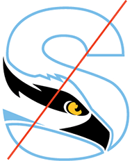
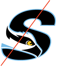
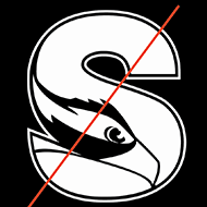
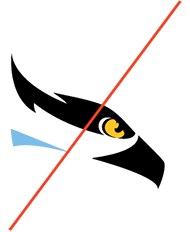
The Stockton logo should not be modified in any way. The example below show incorrect uses of the logo including color modifications and disproportionate resizing.


The "S" spirit symbol is designed for limited use to identify Stockton’s image in a creative and bold manner.
The "S" spirit symbol is an alternate method of identifying Stockton graphically, featuring the school’s mascot, the osprey. It is less formal than the Stockton seal and wordmarks but offers an opportunity to build the University’s brand equity in a casual manner.
The "S" spirit symbol should be used as a piece of art in informal or casual communication and should not be used as a substitute for, or compete with, Stockton’s seal or wordmarks. It should not be used as typography, such as a letter in a word.
The "S" spirit symbol may be used by University departments and recognized student organizations with permission from the Office of University Relations & Marketing.
The Office of University Relations & Marketing will work with your department to determine the proper and best usage of the "S" spirit symbol.
The "S" spirit symbol must not be reduced to less than 3/4 of an inch in width because they become illegible. When resizing the "S" spirit symbol, resize proportionately. Ensure visibility of the "S" spirit symbol by leaving an appropriate amount of space around the image.

Correct Uses


Incorrect Uses

The Athletics Identity honors the history, tradition, integrity and spirit of Stockton’s intercollegiate athletics programs.
Only approved, unaltered versions of the Athletics identity should be used. The logos should not be combined with wordmarks, taglines or any other graphic to give the appearance of a singular graphic. The logos must not be reduced to less than one inch in width because they become illegible. When resizing the logo, resize proportionately. Ensure visibility of the logos by leaving an appropriate amount of clear space around the image.
 Full color Athletic wordmark with PMS 292, 123, Black and White
 Full color Athletic logo with PMS 292, 123, Black and White

Full color Athletic logo with PMS 292, 123, Black and White

Grayscale Ospreys logo

1 color (Black) Ospreys logo

1 color (White) Athletic logo
![]()
Full color “S” logo with
PMS 292, 123, Black and White

Full color Osprey head with
PMS 292, 123, Black and White
Wordmarks for Schools, Centers, Offices, Programs and Instructional Sites are designed to align their name with the University visually.
Stockton wordmarks feature a specific font treatment and are treated as artwork, not as typography. Wordmarks for Schools, Centers, Offices, Programs and Instructional Sites may be used on promotional materials, specialty items, websites, and other related uses.
Wordmark Styles
for Schools, Centers, Offices, Programs and Instructional Sites
Primary Logo
Tier 2
Tier 3


Stockton wordmarks are organized into a hierarchal organization called tiers. The tier system expands functionality by introducing levels of branding, pairing schools, programs and institutes.
- Primary Logo – the Stockton University official wordmark
- Tier 2 – Individual school, division, department or office
- Tier 3 – Center, institute, program or department within a school or division
The Stockton brand is consistently represented in tier 1 while a heavier font, caps formatting and increased size are used to establish between tiers 2 and 3.
Stockton wordmarks should always appear in black or alternately white on dark backgrounds.
Exceptions need approval from the Office of University Relations & Marketing.
Stockton wordmarks should not be altered except to enlarge or reduce proportionately.
Approved, unaltered versions of the Stockton wordmarks are available from the Office of University Relations & Marketing.
Wordmarks must not be reduced to less than 2 1/4 inches in width because they become illegible. When resizing wordmarks, resize proportionately. Ensure visibility of the wordmarks by leaving an appropriate amount of space around the image.
If your School, Center, Office, Program or Instructional Site needs a wordmark, please request one using the University Relations and Marketing request form.
Incorrect Uses
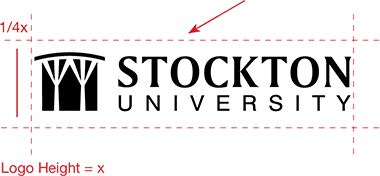
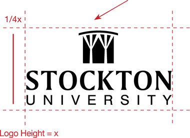
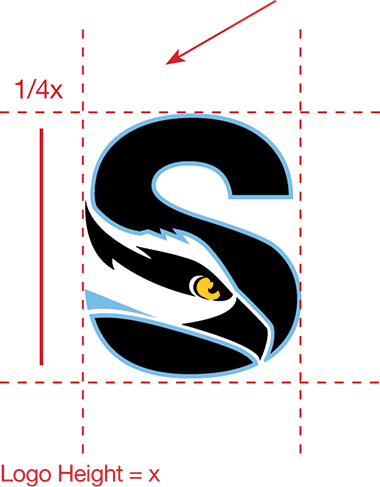
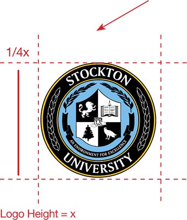
The minimum clear space area ensures that other elements do not infringe upon the identifiers, allowing them to be easily seen and recognized.
Do not place other graphics or typography in the minimum clear space area. Clear space around the logo allows for instant recognition and makes our materials easy to read and navigate. The clear space is proportional to the logo, and is based on the logo height or width. The minimum distance of isolation is 1/4x. The logo may be placed over photography that provides enough contrast and does not affect readability.
A selection of logos and templates are available on our templates & downloads page: